




15 min read
Dashboards and reporting
Learn to create engaging dashboards and reports with canvas formulas, charts, and graphs.

What you'll learn:
- Quickly summarize data in the canvas
- Automate progress bars to illustrate metrics
- Creating charts from tables
- Combining tables to create custom graphs

What you'll use:
- Canvas formulas
- The Filter() formula
- Relation columns
- Graphs and charts
Highlight key metrics and insights in the canvas
Superhuman Docs allows you to create dynamic text directly in the canvas using formulas. These canvas formulas can be freestanding and independent or tied to data from anywhere else in the doc, making them invaluable for noting key takeaways and highlighting important metrics in dashboards and reports. To better illustrate, let's take a look at our example sales dashboard. We've used a canvas formula to automatically count how many opportunities are in our table. When we update the table, the canvas formula updates the total too.When rows are added or deleted from the table, the canvas formula automatically reflects the changes
Use the summarize feature for quick canvas formulas
Calculating aggregates and summarizing table data in the canvas used to be tricky as it required an understanding of formulas. The table summaries feature now makes this much easier by letting you do this through a structured builder where you can select the table/view that you want to summarize and then choose the properties or calculations you want to perform on them. You can use the builder to show summaries directly in the canvas, or display column-specific summaries directly in the table. Let’s use the table summarize feature to count how many of our tasks are In Progress.Progress bars that update formulaically
Progress bars provide a visual representation of completion status or performance metrics, allowing users to quickly and easily gauge progress at a glance. They are intuitive and easy to understand, making them an effective way to convey complex information in a simple and digestible format. You can use formulas to set the values of progress bars, allowing them to automatically update as you work. This can provide realtime insight into goals, milestones, or project timelines, enabling your team to operate more efficiently, prioritize tasks, and stay on track. Alternatively, progress bars can be used to compare actual progress against targets or benchmarks, enabling users to identify areas that may require attention or improvement. Returning to our task table, we will use a progress bar to illustrate what percentage of tasks are in progress.We use a formula in the progress bar that divides the current opportunity value total by the overall sales goal to get a percent complete.
Graphs are views of tables
To make a chart or graph, create a view of the table that contains the data you want to visualize, then toggle the view type to chart. Learn more about chart types and formatting here.Make a new view of a table then change the view type to "Chart".
Connecting tables
If data is spread across multiple tables, consider using a relation column to bring the information together into one table. You may need to do some creative data cleanup to connect the tables. If two data points live on separate tables that are NOT currently connected by a relation column, you will need to figure out a way to link them. Example: You have a table of tasks, each assigned to an Owner. You also have team roster that splits your org into smaller pods. You want to create a graph that shows how many tasks there are per pod. You have a problem! Your task table does not include which pod owns it! What will you do?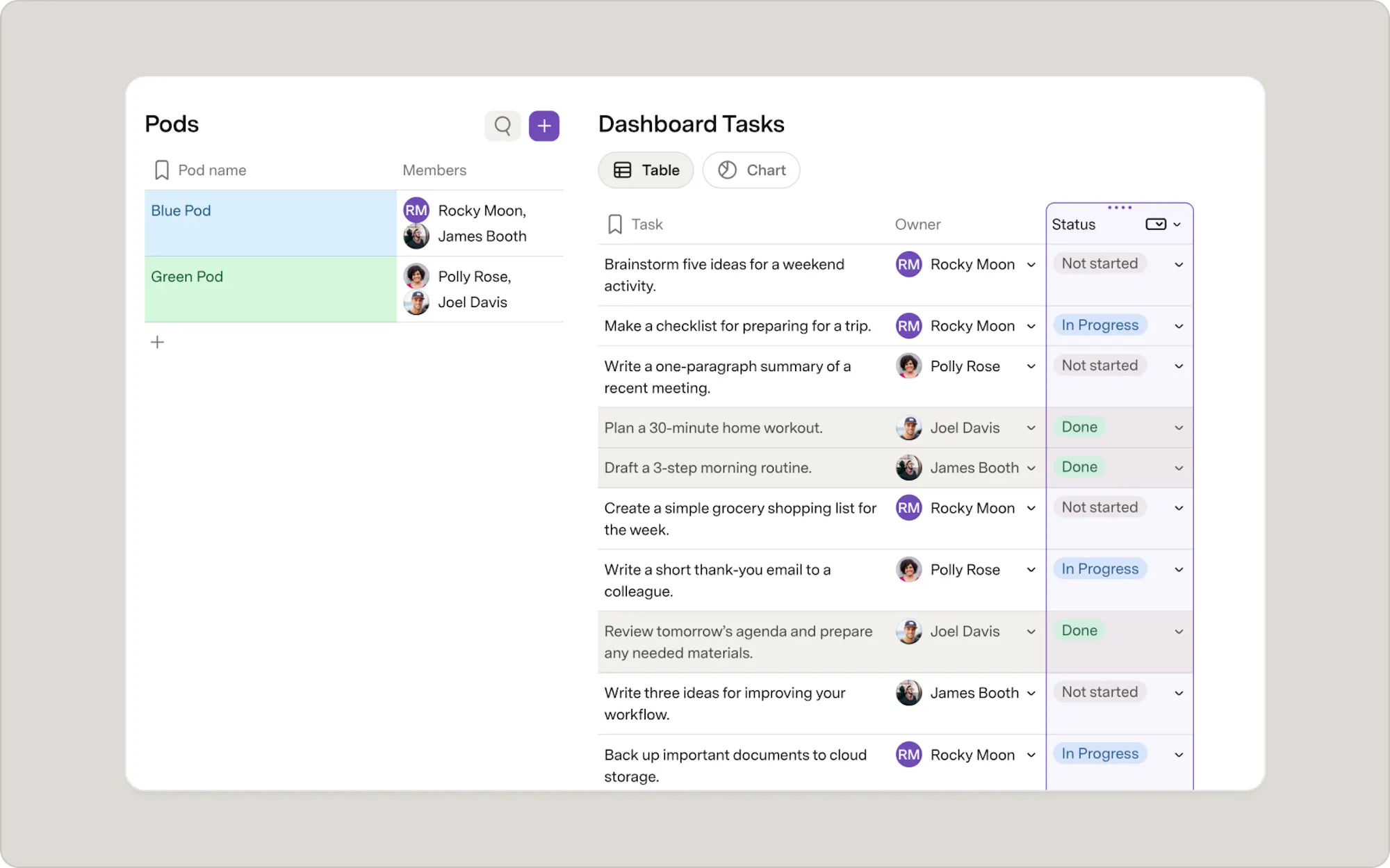
Our opportunity table contains the rep but not the pod! What will we do?
Use related columns to bring in data from relation columns
Once tables are connected with a relation column, you can easily add columns from one table to the other.Looking at our example, let’s say each pod has a bandwidth and you'd like to see that number in your tasks table. To do this, we would need to bring in the bandwidth column into the tasks table. Because we’ve already connected the pod table to the tasks table with a relation column, we can easily add the appropriate bandwidth to each task using the related column feature.
Now what?
Dashboards are great ways to get the right information to the right people...right where they need it! Check out these other resources to keep you building:- New table or new view? — go deeper on when to create a connected view instead of a new table
- Creating a tagging system — build a filtering and tagging system to keep your views organized as your doc grows
Was this helpful?
YesNo